Bright smiles begin here
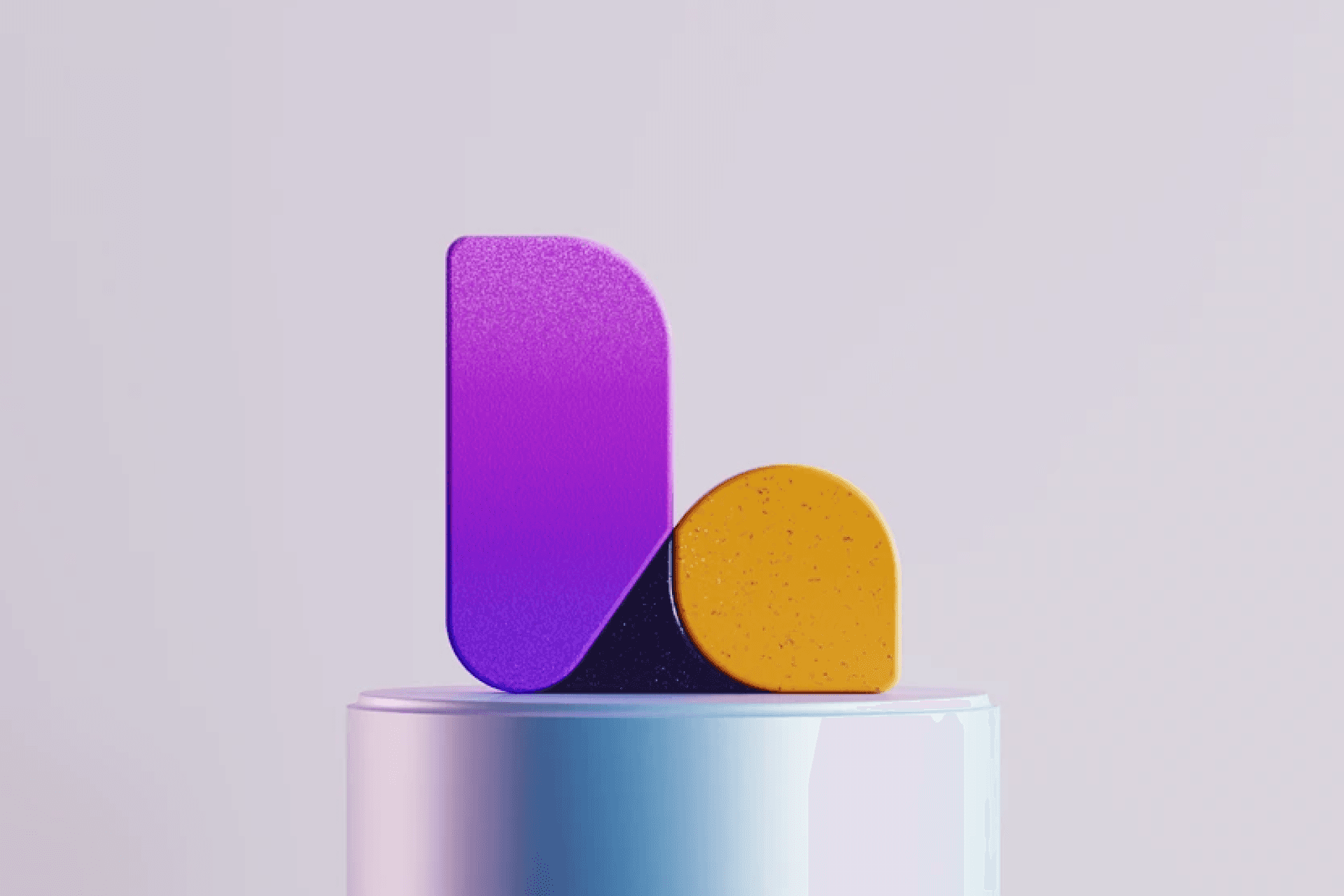
LassoMD pairs precise geometry with a friendly character, bringing sharp lettering and softer visual forms together.
Brand
LassoMD
Resource
LassoMD · Brand guide
Format
PDF guide
Best for
A professional identity with a friendly geometric core
Friendly geometry gives professional services character
Sharp geometry meets softer, more welcoming forms.
The document connects that signature with colour, type and a confident voice for medical practices. Applications show a service brand combining immediate recognition with readable communication.
For LassoMD, the useful comparison is between a professional identity with a friendly geometric core and the individual examples below. Start with the foundations, then follow how the same choices appear in different settings.


Credits
Identity: LassoMD
Source artwork: LassoMD brand guide
Editorial: Brandguidelines
Lasso builds its mark from an L graphic and wordmark, pairing sharp geometry with friendly forms. Compare the detail with the wider layout.
The document connects that signature with colour, type and a confident voice for medical practices. See how the visual choices connect.
Applications show a service brand combining immediate recognition with readable communication. Compare the detail with the wider layout.